Black and Gray vs. Color Tattoo Ink: Choosing the Right Approach
Two artists can tattoo the same design and produce completely different emotions — one in moody black and gray, the other in vivid color. Neither is better; they’re different languages. But the choice ripples through everything: the inks you stock, the needles you reach for, how the piece ages, and even which clients seek you out. Understanding both approaches makes you a more versatile, intentional artist.
Here’s a clear comparison of black-and-gray versus color work, and how to decide which to lean into.
The Look and Feel of Each Style
Black and gray is built on contrast, depth, and subtlety. It excels at realism, portraits, and smooth, dramatic shading. Color work, by contrast, is bold, energetic, and expressive — perfect for traditional, neo-traditional, and illustrative styles that demand vibrancy.
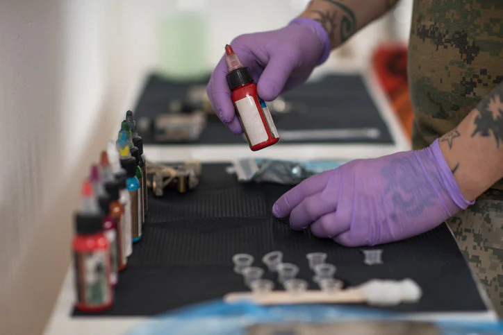
Ink Requirements
| Style | Core inks | Notes |
|---|---|---|
| Black & gray | Black + gray-wash system | Leaner kit, master dilution |
| Color | Black + full color palette | Larger kit, color theory matters |
Black and gray keeps your kit lean — a strong black and a gray-wash workflow go a long way. Color work asks for a thoughtfully built palette. If you’re assembling your first set, our beginner ink set guide walks through exactly what to buy.
Longevity and Aging
How a tattoo ages depends on pigment, placement, skin type, and aftercare. Generally, black and gray tends to age gracefully thanks to stable carbon-based pigments, while some bright colors can soften more over years of sun exposure. This isn’t a reason to avoid color — it’s a reason to set honest client expectations and emphasize aftercare. Our ink pigments and longevity guide goes deeper here.
Technique Differences
Black and gray rewards mastery of value, contrast, and smooth gradients — often with magnums and careful dilution. Color work demands strong saturation, clean color transitions, and an understanding of how pigments interact in the skin. Both require packing skill, but the mental model differs.
Which Should You Specialize In?
Many artists begin with black and gray because it isolates the fundamentals of value and contrast without the added variable of color theory. Others are drawn straight to color’s energy. There’s no wrong path — and the strongest portfolios often show command of both. Let your artistic voice and your local clientele guide you.
Whichever you pursue, quality ink is the foundation. Explore singles and sets in our tattoo ink supplies collection.
Safety Applies to Both
Regardless of style, ink safety is universal: source from reputable manufacturers, use single-use cups, and never return unused ink to the bottle. Regulations on tattoo inks vary by region, so it’s worth knowing the standards that apply where you work — the FDA’s tattoo and permanent makeup fact sheet is a useful starting reference.
Frequently Asked Questions
Is black and gray easier to learn than color? Many find it a cleaner way to master value and contrast first, but “easier” depends on the artist.
Does color always fade faster than black? Not always — it depends on pigment, placement, sun exposure, and aftercare.
Can I mix both styles in one piece? Absolutely. Many modern pieces blend bold color with black-and-gray depth.
Final Thoughts
Black and gray and color aren’t competitors — they’re two powerful ways to tell a story in skin. Learn the strengths of each, stock the right inks, and set honest expectations about how every piece will age. The most resilient artists speak both languages fluently.


Add comment